An innovative new collection built on a strong colour story.
‘From white at midday to black at midnight.’
Aristotle
(384-322 BC)
Name: DeepColor Surface Collection
Client: DuPont Corian® - North America
Industry: Solid Surfaces, Architecture & Interior Design
_
AESTHETIC DEVELOPMENT
BESPOKE COLOUR, MATERIAL & FINISH
ART DIRECTION
DESIGN EDITORIAL
On behalf of the North America DuPont Corian® Marketing and R&D teams, Laura designed an in-depth trend report providing clear inspiration for future surface finish and colour for the interior design industry. This enabled Dupont to form a strong visual identity, of textural yet saturated midnight tones, for their new surface technology - Deep Color.
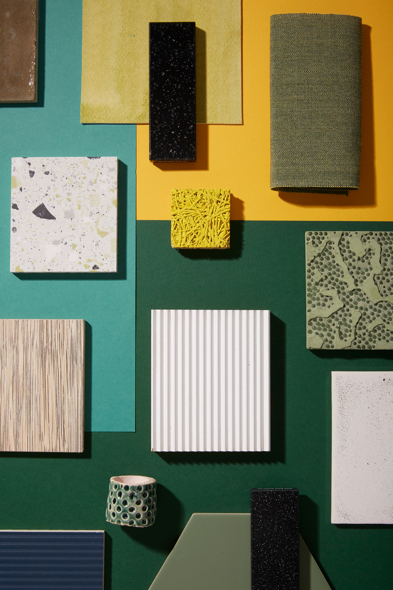
The trend research highlighted the need to connect with the senses through mood and tactile experience. Three design themes: Solidify, Interference and Raw formed an elemental approach to the collection.
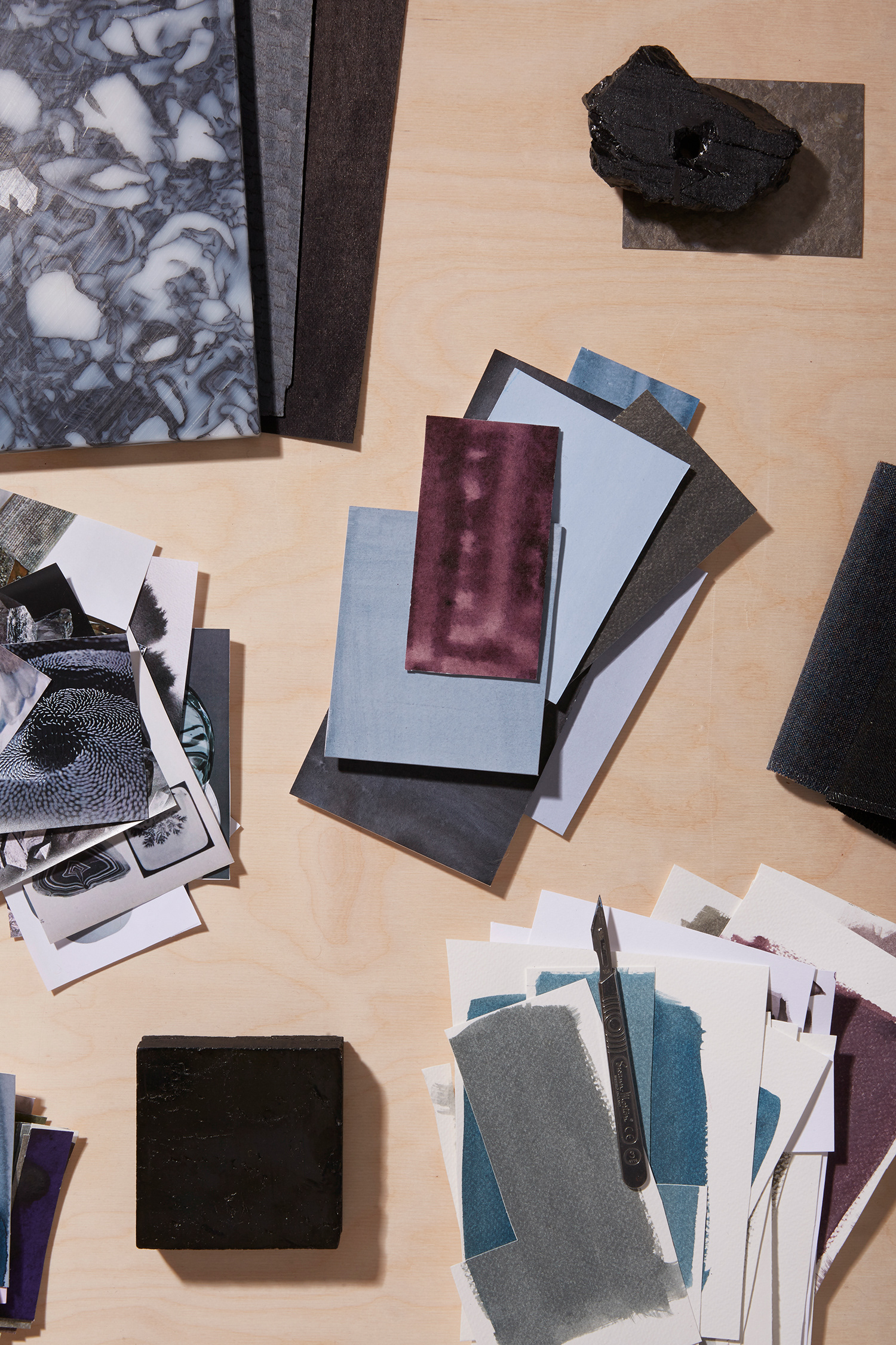
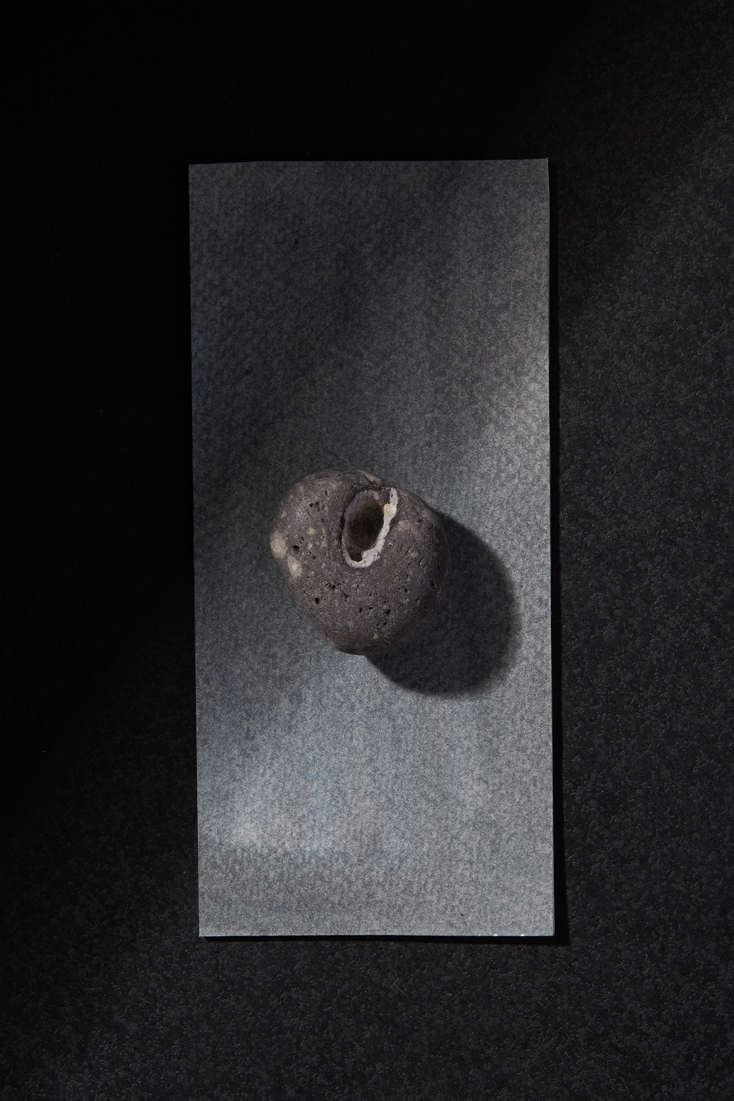
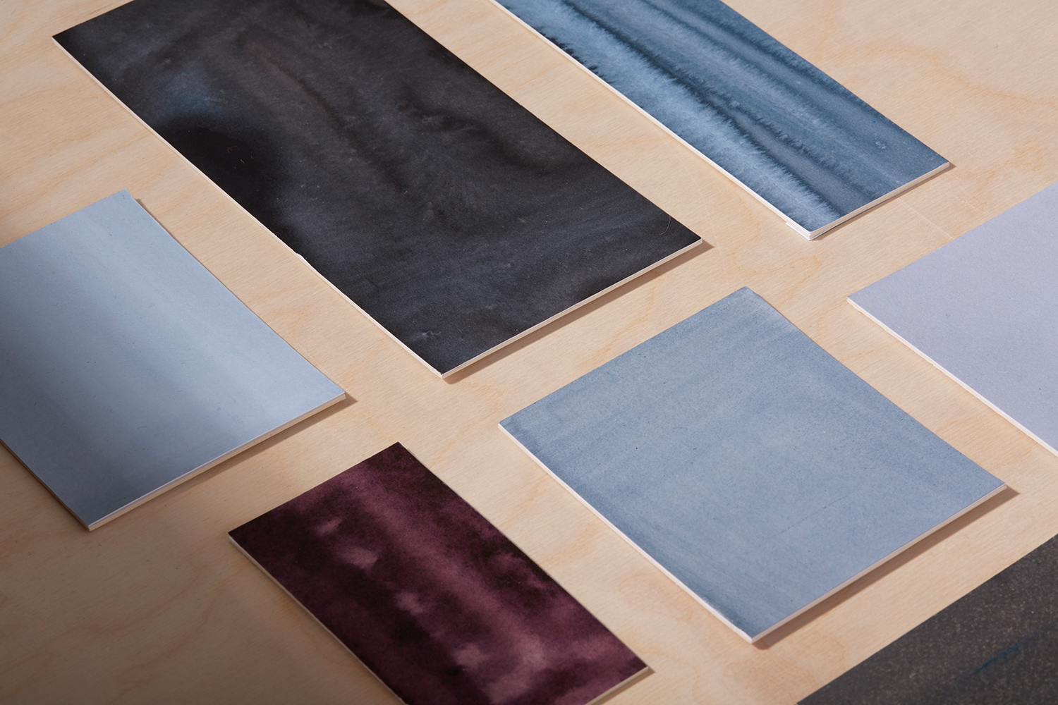
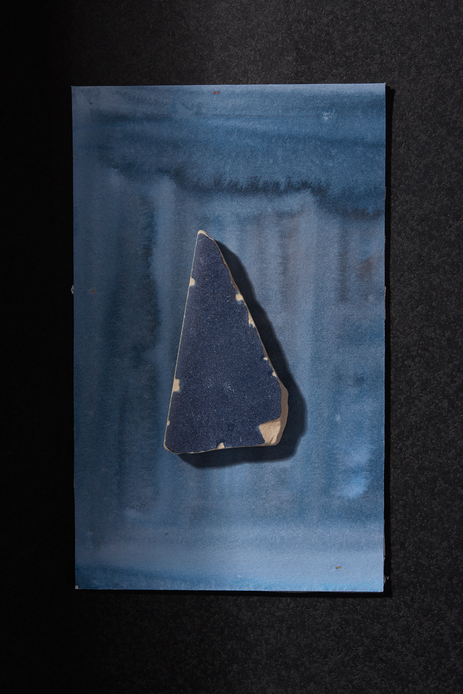
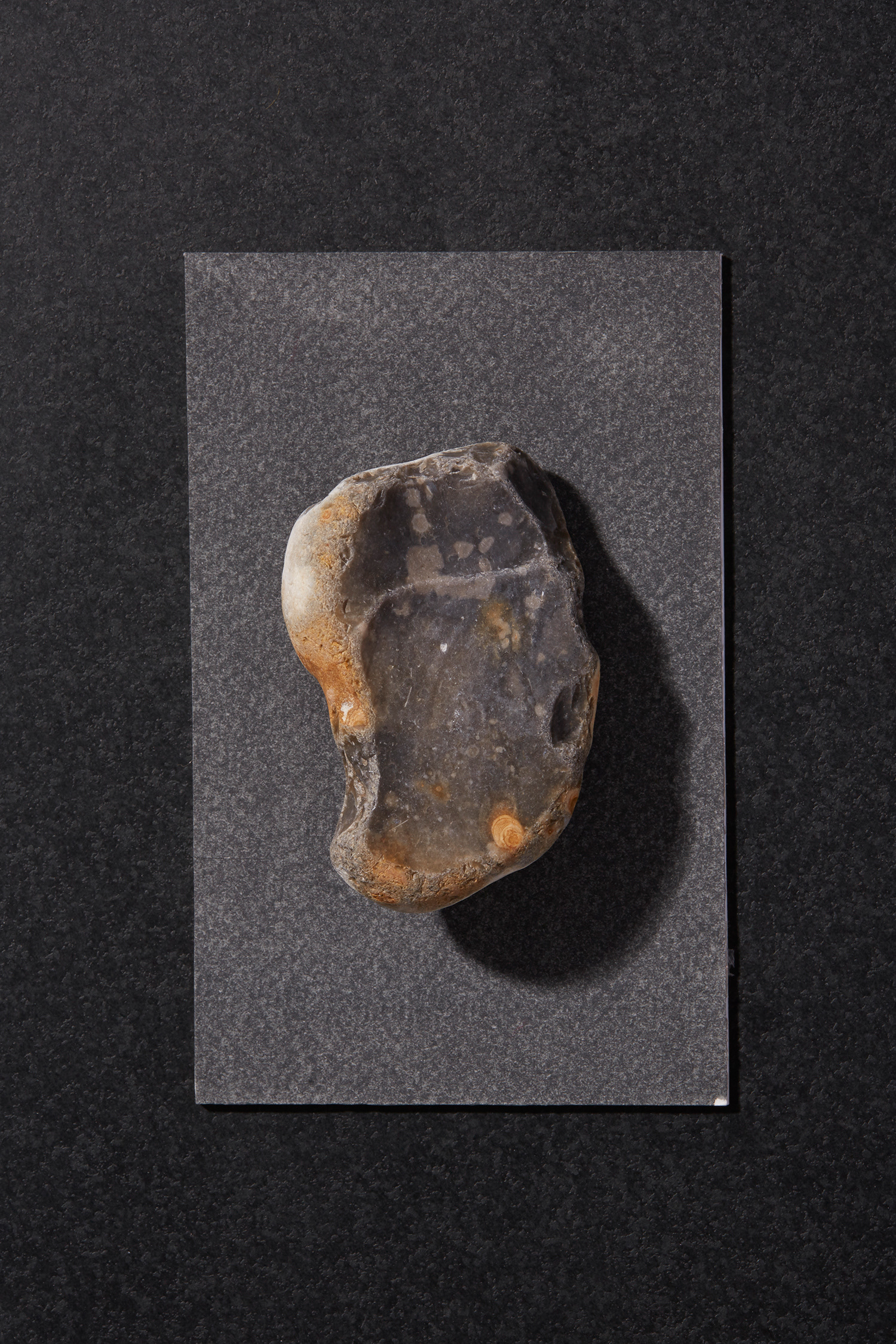
Inspired by Aristotle who developed the first linear colour scale and proposed that all hues came from light/white and black/no light. The colours were derived from the organic beauty of natural minerals, and the ever-changing qualities in the light. Laura developed unique colour samples made by hand to inform the industrial process and story behind the new surface launch.
DuPont Corian® is a beautiful high-tech surface, developed to create a higher performing surface than other commercial alternatives. DuPont Corian® is renowned for exceptional versatility, beauty and almost limitless applications for residential, public and commercial environments.
AESTHETIC DEVELOPMENT
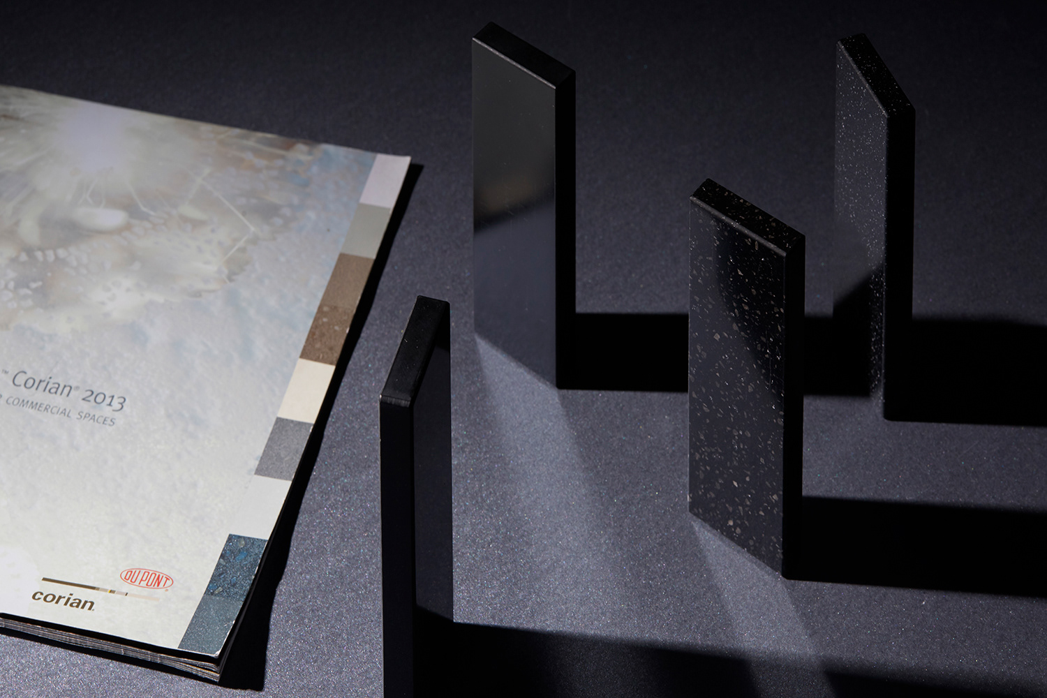
By creating samples of hand-made colour and texture, Laura created a unique set of hues for Corian, informing the industrial process and story for the collection launch.
Selecting found stones and naturally occurring minerals, Laura observed and intermixing reds, blues and greens to create tones of blacks and ethereal greys without the use of pure carbon, opening up a gamut of ethereal colour. The textural effects achieved through the hand-brushed application of ink, informed the irregular and organic patterning in the Deep Color Collection.
DESIGN EDITORIAL
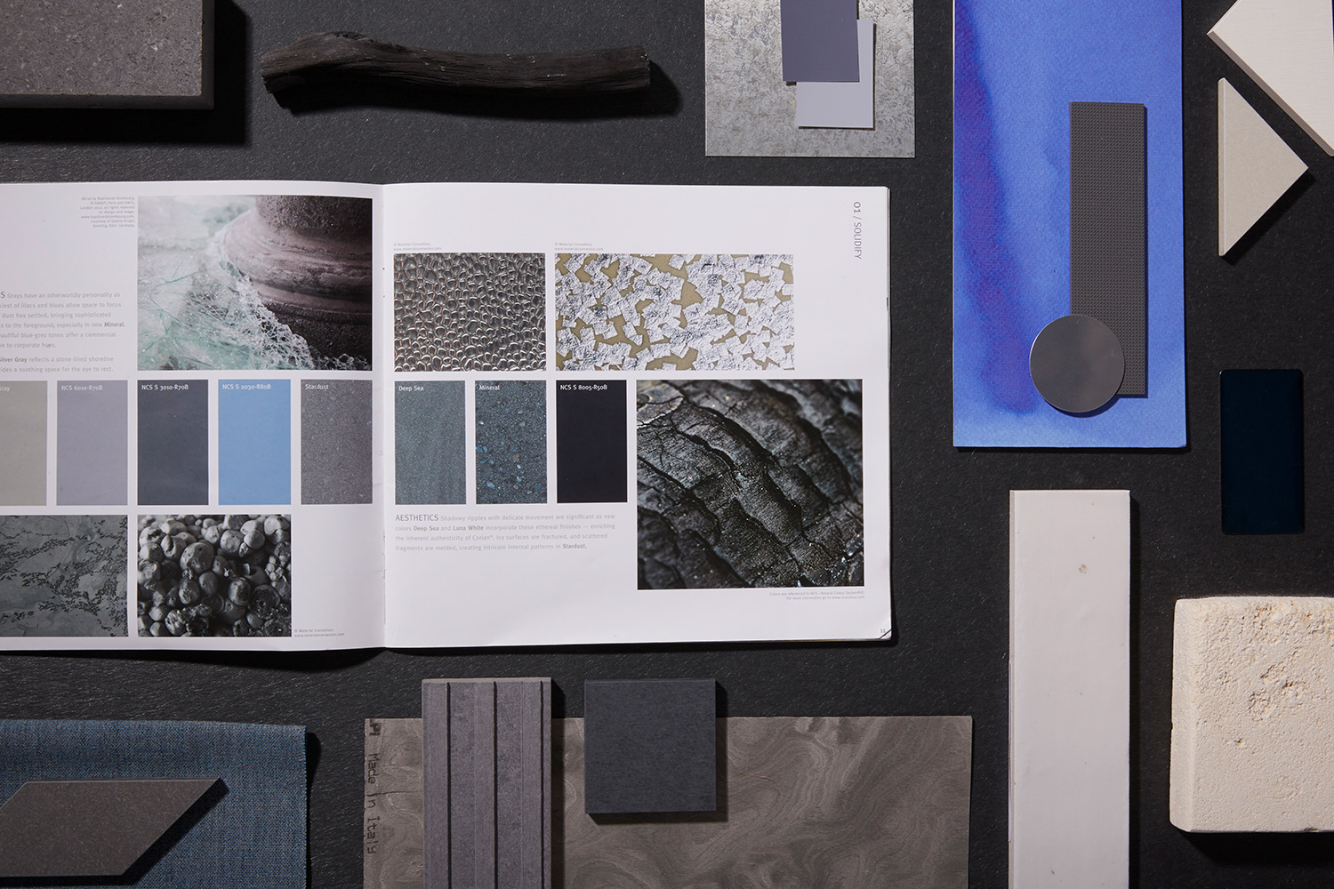
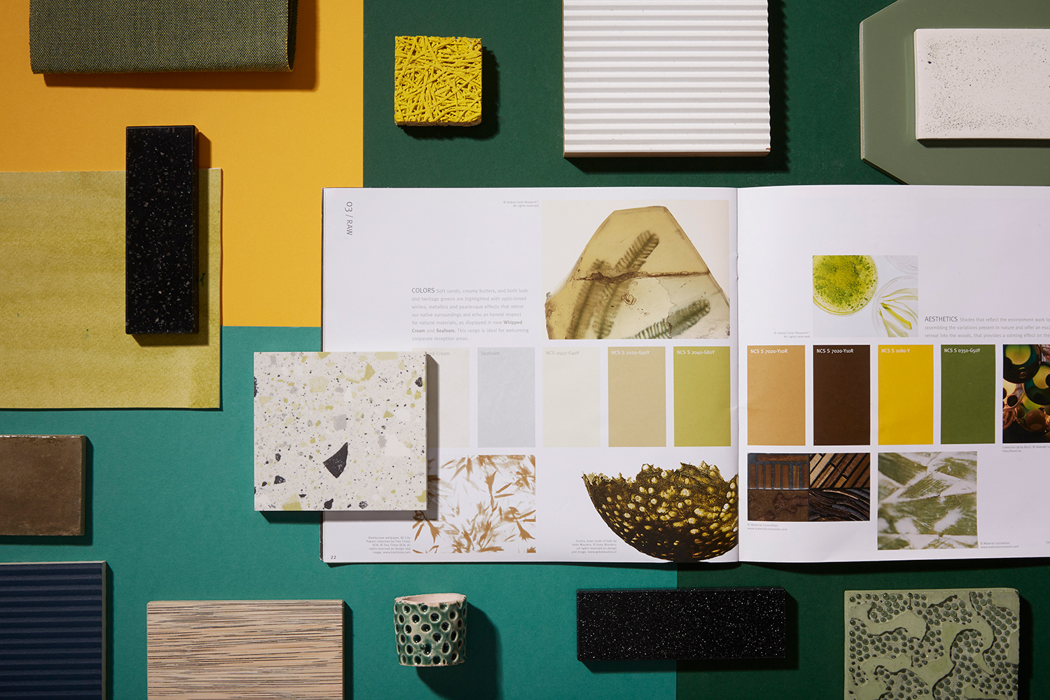
An accompanying book, showcased the trend themes and stories demonstrating how micro trends in colour and materials could manifest in an interiors context.
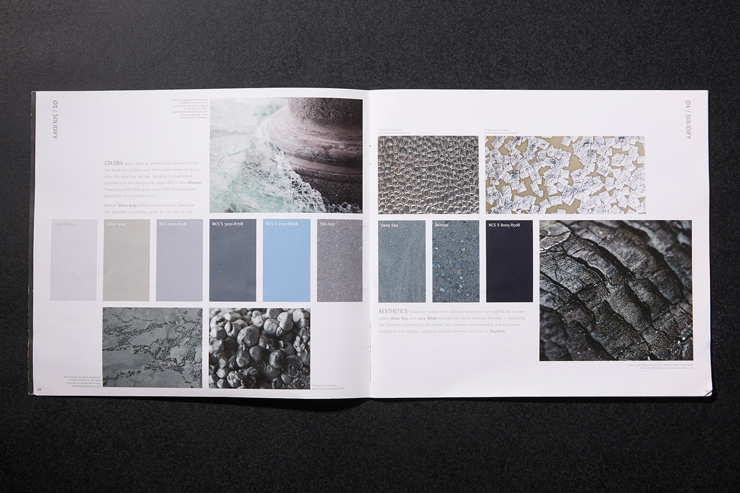
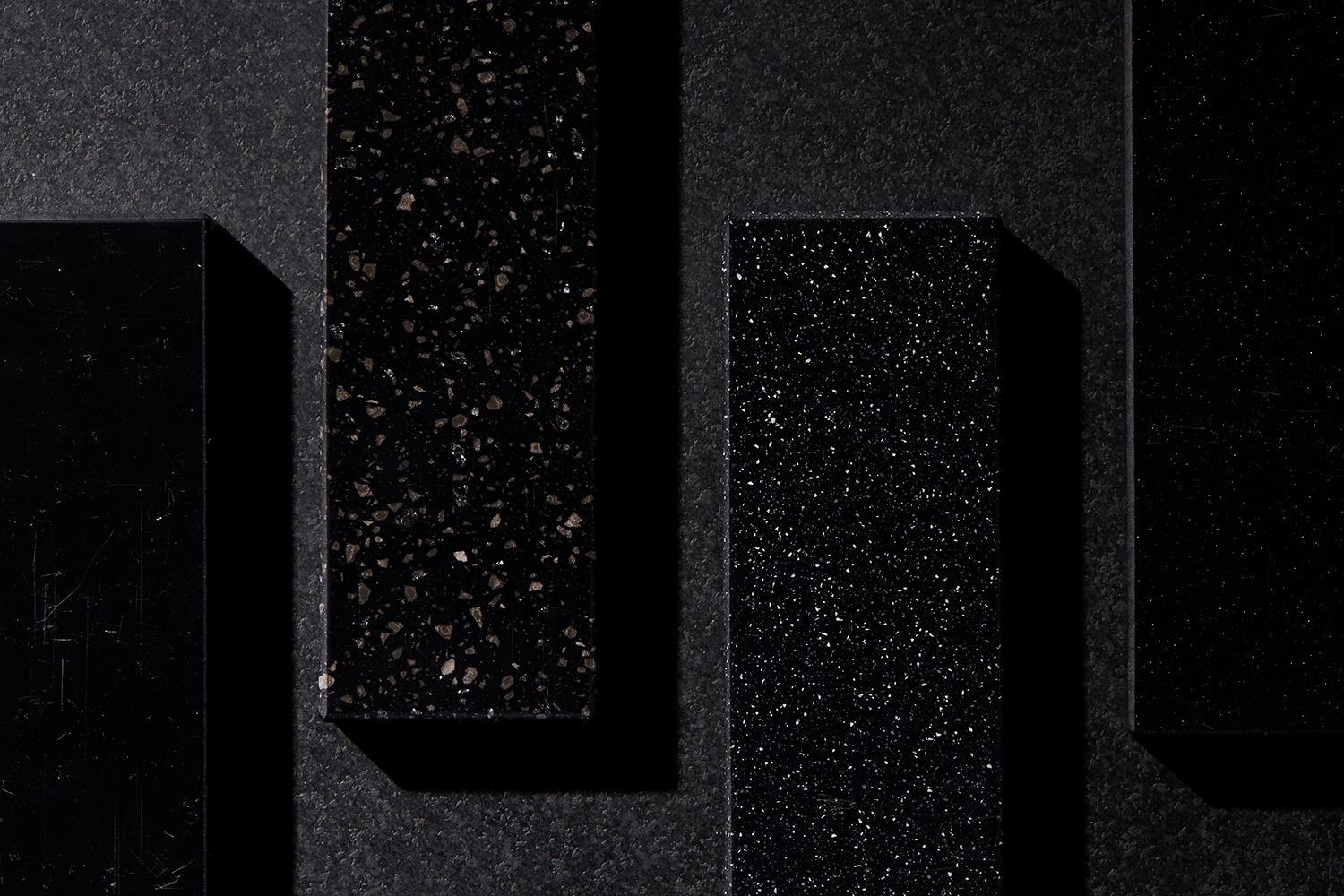
o1/ Solidify
A palette of ghost-like greys, lilacs and blues inspired by a future in transition. These transient tones complement, sensory finishes such as light metallic flecks and authentic materials such as charcoal, creating a sophisticated yet soft mood for interiors.
02/ Raw
A back to nature palette that offers a soothing respite of lush greens and yellows ideal for residential environments. Corian patterns complement natural textures such as wood and textile bringing an authenticity to interiors.
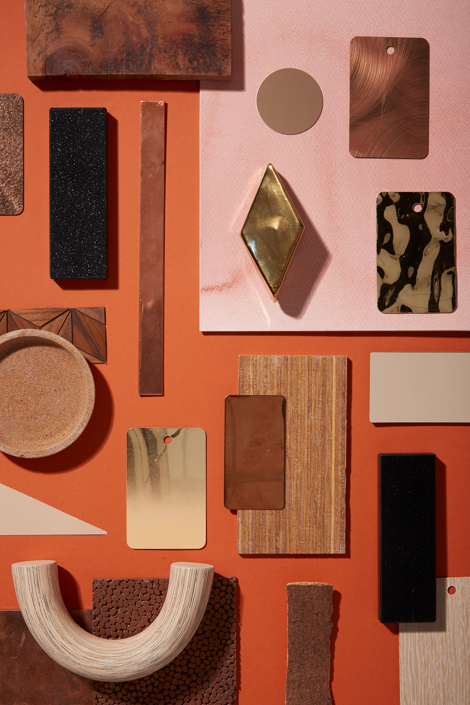
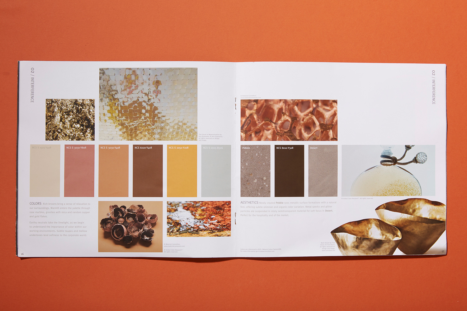
03/ Interference
Earthy neutrals take the limelight, as we begin to understand the importance of warm nurturing shades in working environments. Rose-tinted marbles, and irregular hammered copper fill the palette with warmth and comfort.