Issue 239
Designing for joy and neuroinclusive spaces
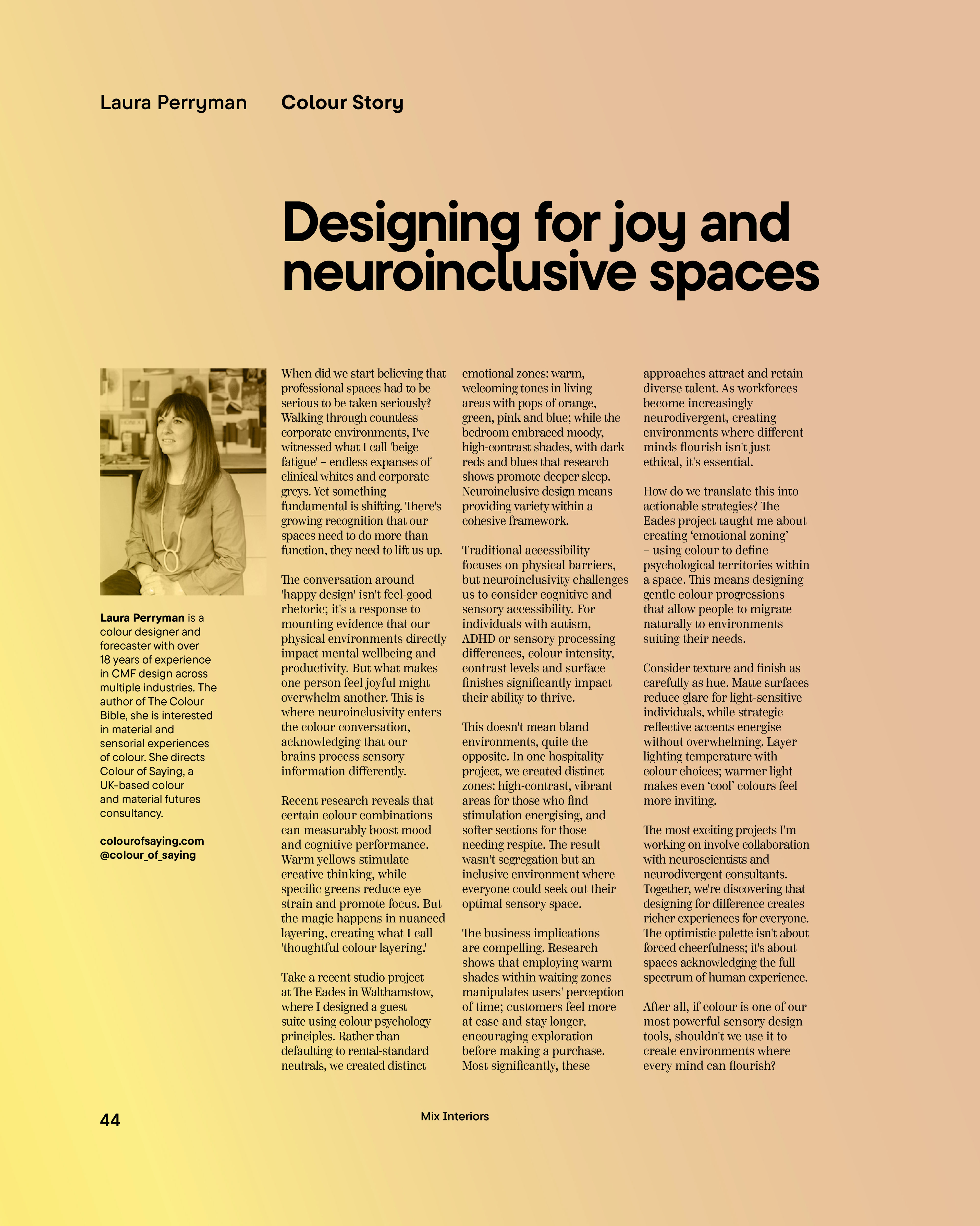
Written by Laura Perryman for Mix Interiors, August 2025
"The conversation around 'happy design' isn't feel-good
rhetoric; it's a response to mounting evidence that our
physical environments directly impact mental wellbeing and
productivity."
When did we start believing that professional spaces had to be serious to be taken seriously? Walking through countless corporate environments, I've witnessed what I call 'beige fatigue' – endless expanses of clinical whites and corporate greys.
Yet something fundamental is shifting. There's growing recognition that our spaces need to do more than function, they need to lift us up. The conversation around 'happy design' isn't feel-good rhetoric; it's a response to mounting evidence that our physical environments directly impact mental wellbeing and productivity. But what makes one person feel joyful might overwhelm another. This is where neuroinclusivity enters the colour conversation, acknowledging that our brains process sensory information differently.
Yet something fundamental is shifting. There's growing recognition that our spaces need to do more than function, they need to lift us up. The conversation around 'happy design' isn't feel-good rhetoric; it's a response to mounting evidence that our physical environments directly impact mental wellbeing and productivity. But what makes one person feel joyful might overwhelm another. This is where neuroinclusivity enters the colour conversation, acknowledging that our brains process sensory information differently.

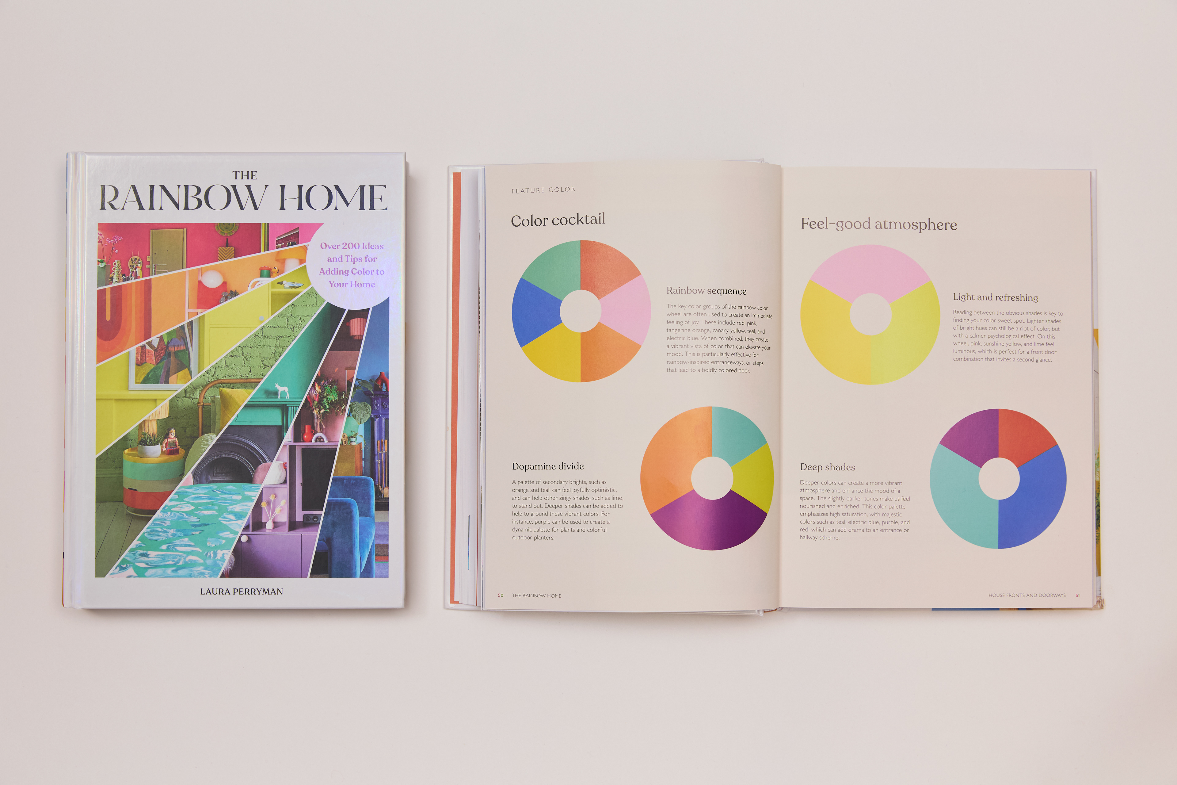
The Rainbow Home by Laura Perryman (2025, Chronicle Books)
"Recent research reveals that certain colour combinations can measurably boost mood and cognitive performance. Warm yellows stimulate creative thinking, while specific greens reduce eye strain and promote focus.
But the magic happens in nuanced layering, creating what I call 'thoughtful colour layering.'
But the magic happens in nuanced layering, creating what I call 'thoughtful colour layering.'
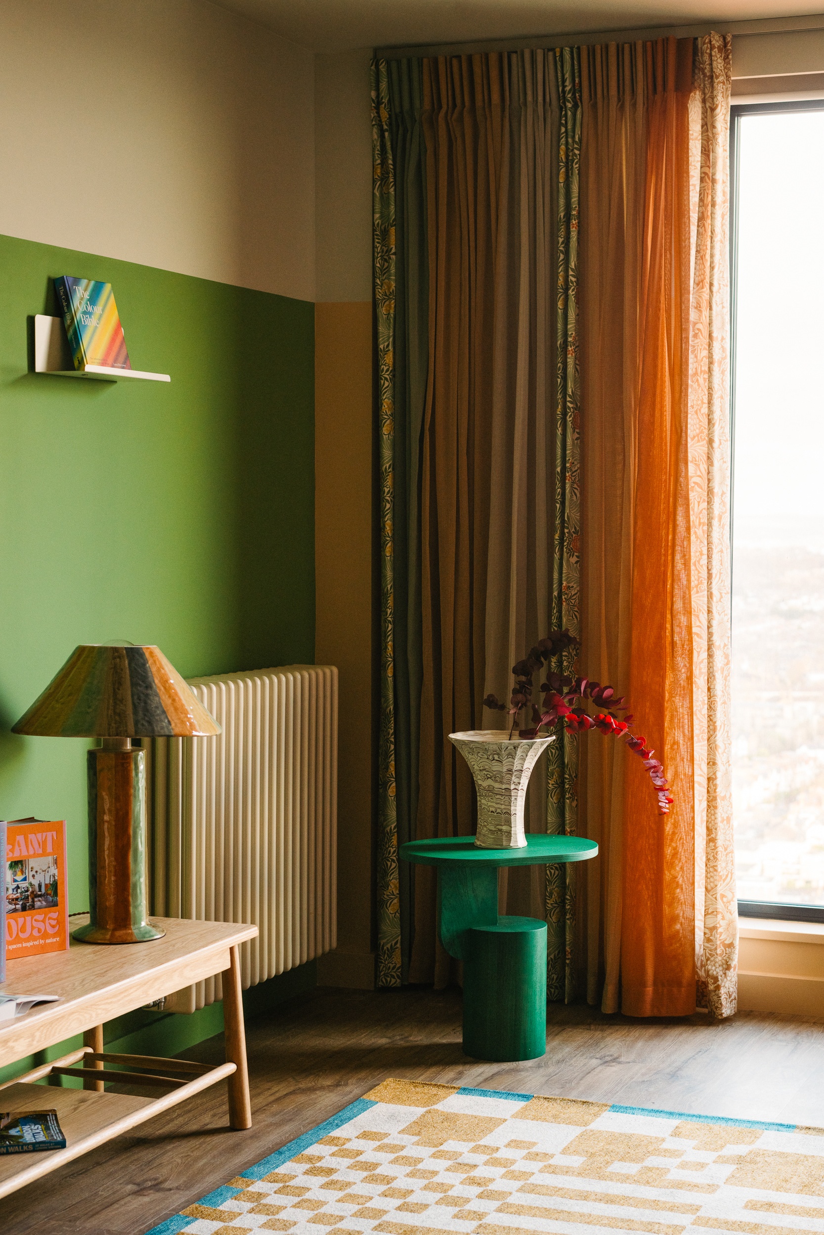
The Eades, Walthamstow, Guest Suite by Laura Perryman for Way of Life
Recent research reveals that certain colour combinations can measurably boost mood and cognitive performance.
Warm yellows stimulate creative thinking, while specific greens reduce eye strain and promote focus. But the magic happens in nuanced layering, creating what I call 'thoughtful colour layering.' Take a recent studio project at The Eades in Walthamstow, where I designed a guest suite using colour psychology principles. Rather than defaulting to rental-standard neutrals, we created distinct emotional zones: warm, welcoming tones in living areas with pops of orange, green, pink and blue; while the bedroom embraced moody, high-contrast shades, with dark reds and blues that research shows promote deeper sleep. Neuroinclusive design means providing variety within a cohesive framework.
Traditional accessibility focuses on physical barriers, but neuroinclusivity challenges us to consider cognitive and sensory accessibility. For individuals with autism, ADHD or sensory processing differences, colour intensity, contrast levels and surface finishes significantly impact their ability to thrive.

This doesn't mean bland environments, quite the opposite. In one hospitality project, we created distinct zones: high-contrast, vibrant areas for those who find stimulation energising, and softer sections for those needing respite. The result wasn't segregation but an inclusive environment where everyone could seek out their optimal sensory space.
The business implications are compelling. Research shows that employing warm shades within waiting zones manipulates users' perception of time; customers feel more at ease and stay longer, encouraging exploration before making a purchase.
Most significantly, these approaches attract and retain diverse talent. As workforces become increasingly neurodivergent, creating environments where different minds flourish isn't just ethical, it's essential.
How do we translate this into actionable strategies? The Eades project taught me about creating ‘emotional zoning’ – using colour to define psychological territories within a space. This means designing gentle colour progressions that allow people to migrate naturally to environments suiting their needs.
Consider texture and finish as carefully as hue. Matte surfaces reduce glare for light-sensitive individuals, while strategic reflective accents energise without overwhelming. Layer lighting temperature with colour choices; warmer light makes even ‘cool’ colours feel more inviting. The most exciting projects I'm working on involve collaboration with neuroscientists and neurodivergent consultants.
Together, we're discovering that designing for difference creates richer experiences for everyone. The optimistic palette isn't about forced cheerfulness; it's about spaces acknowledging the full spectrum of human experience. After all, if colour is one of our most powerful sensory design tools, shouldn't we use it to create environments where every mind can flourish?
"After all, if colour is one of our most powerful sensory design tools, shouldn't we use it to create environments where
every mind can flourish?"
every mind can flourish?"