
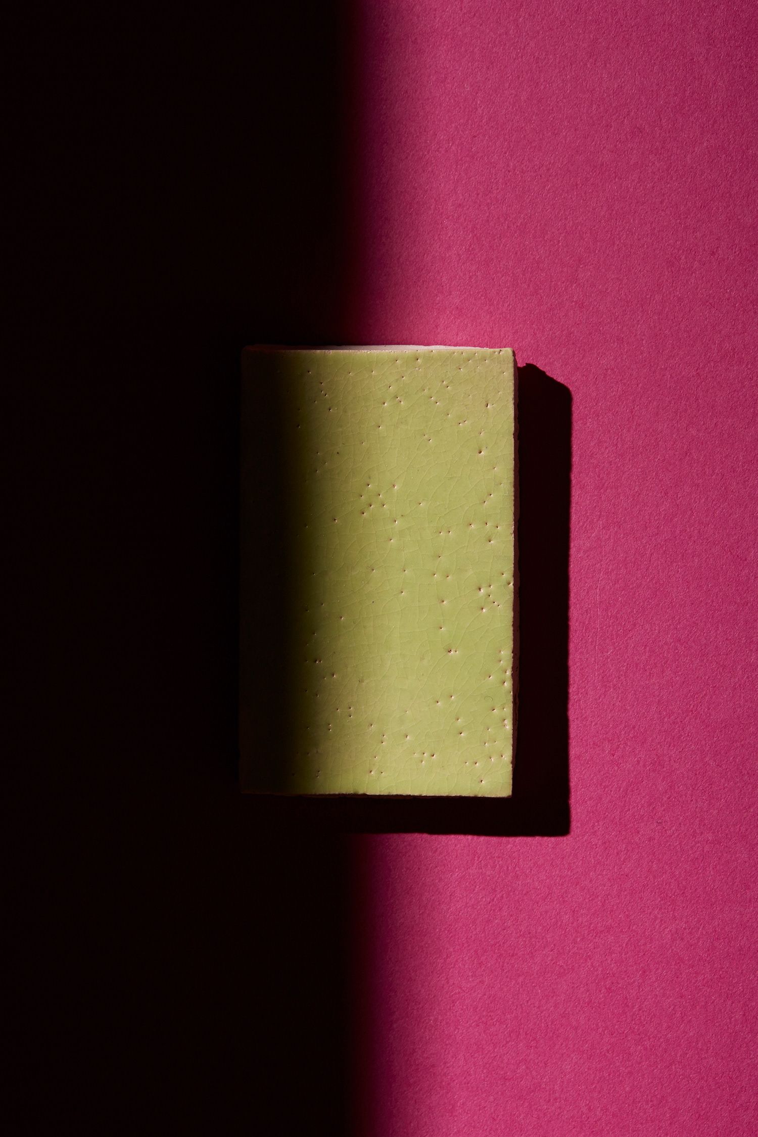
The origins of colour were made by hand. Imperfections, serendipitous irregularities and fading were accepted aesthetics. The RGB Series is the result of a study on handmade colour and glazes. By exploring coloured glaze and translucency levels in the glazes, each fundamental colour RGB (Red, Green & Blue) is broken down and observed in its purest form, a phenomenon known as chromatography. The series also studies the basic influence of colours on other colours, termed simultaneous contrast which laid the building blocks of successful colour palette making.
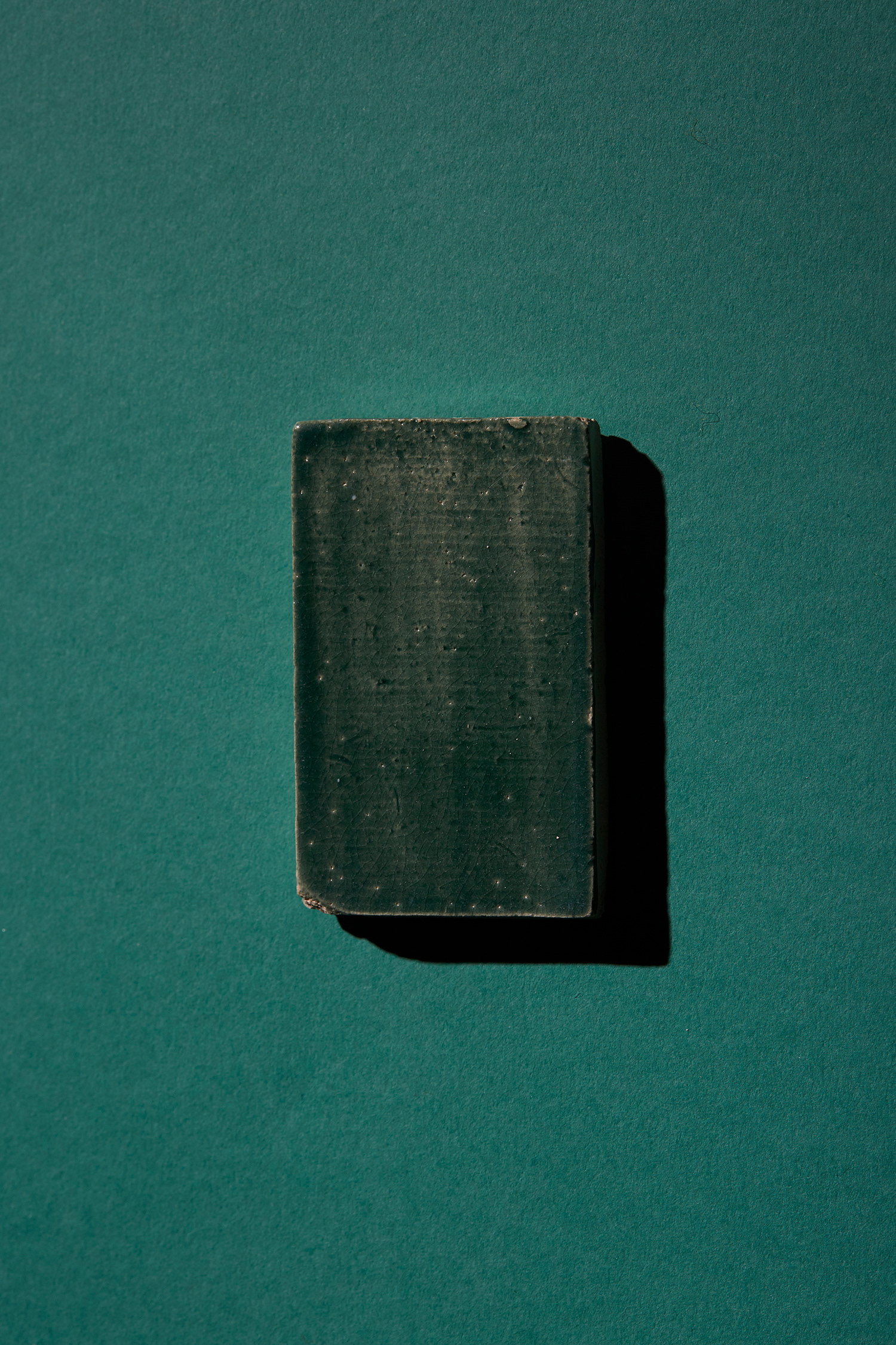
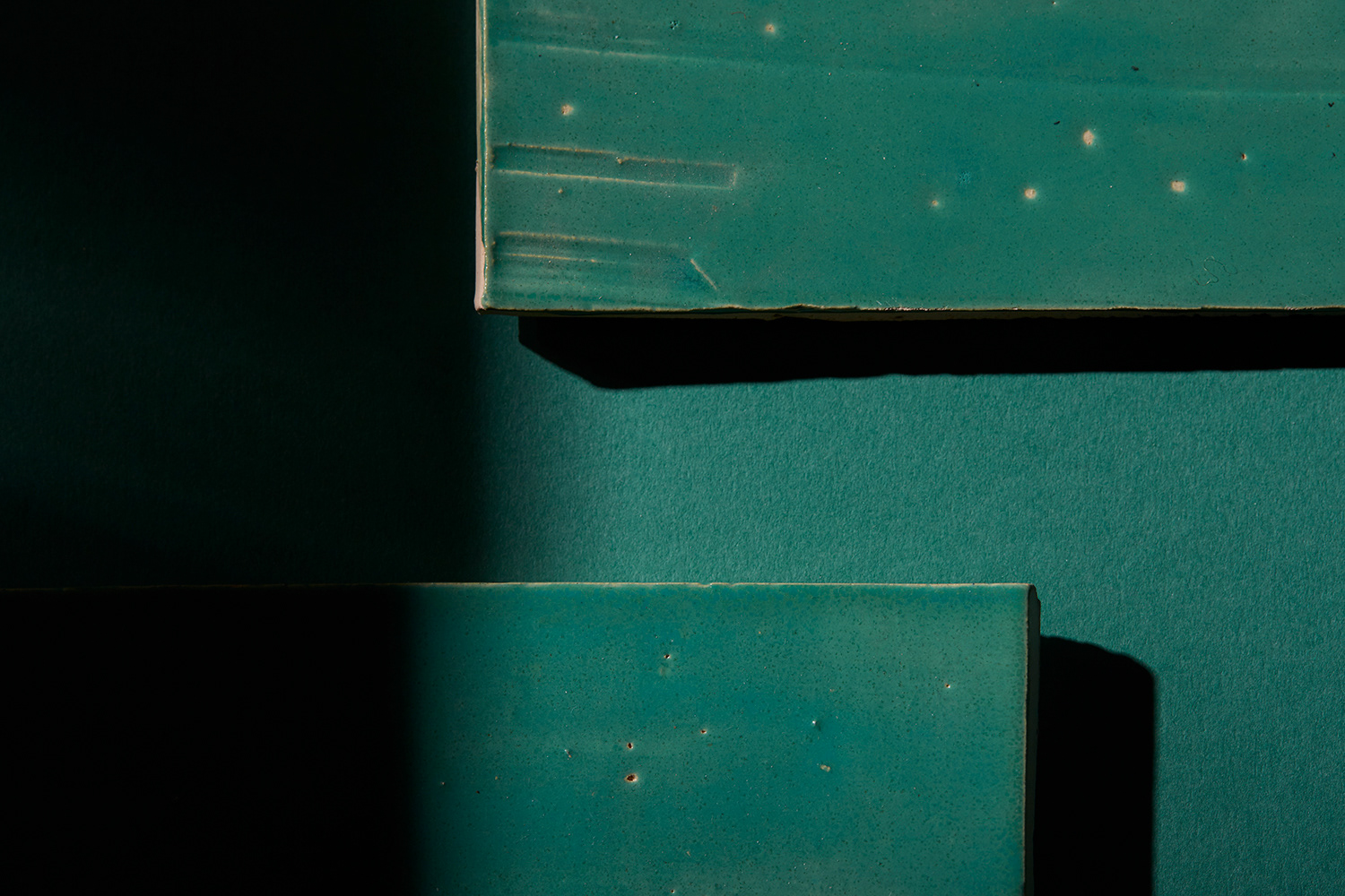
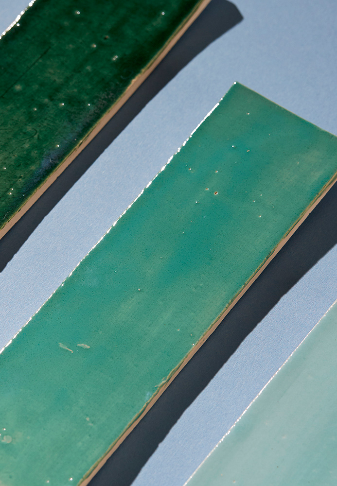
Monotonal Greens
A pure efficient exploration of one hue - green and it's various tones or tints, specifically chosen to create palettes of close-tonal harmonies.
As green is also a particularly comfortable shade for us to look at and the visual effect is simple and sophisticated, streamlining forms and minimising distractions.
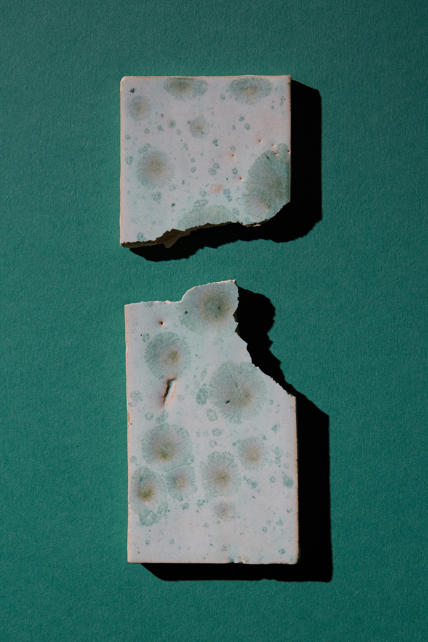
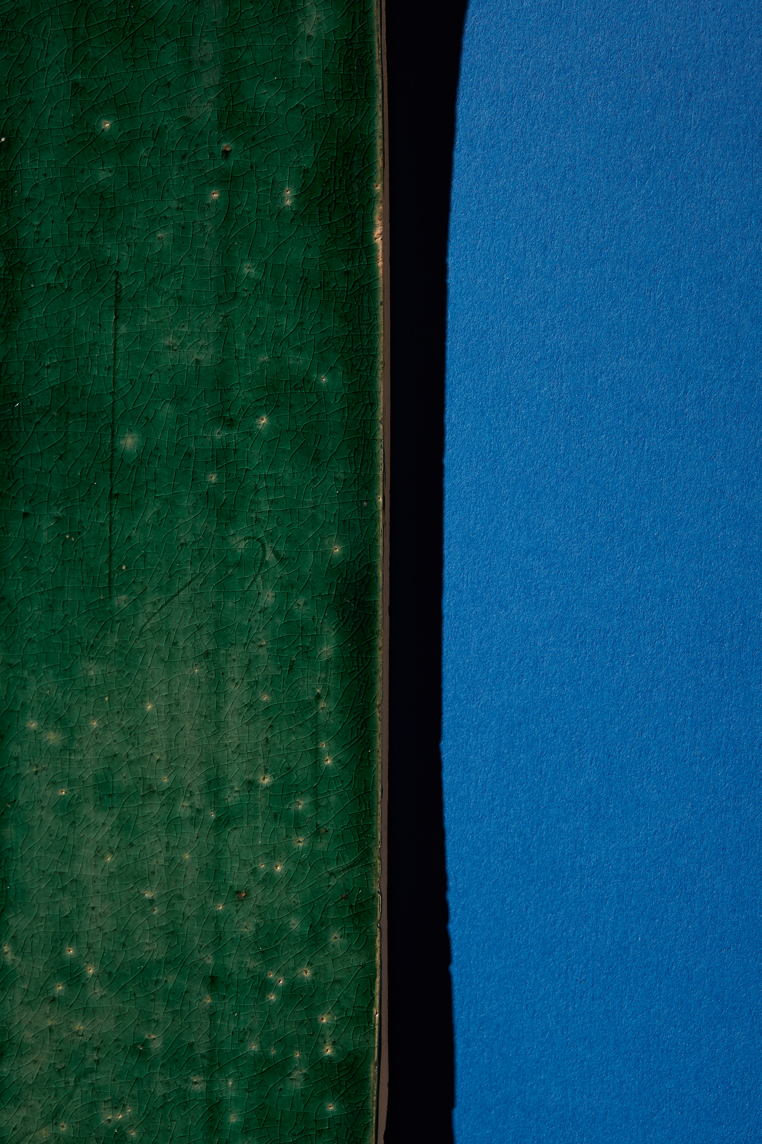
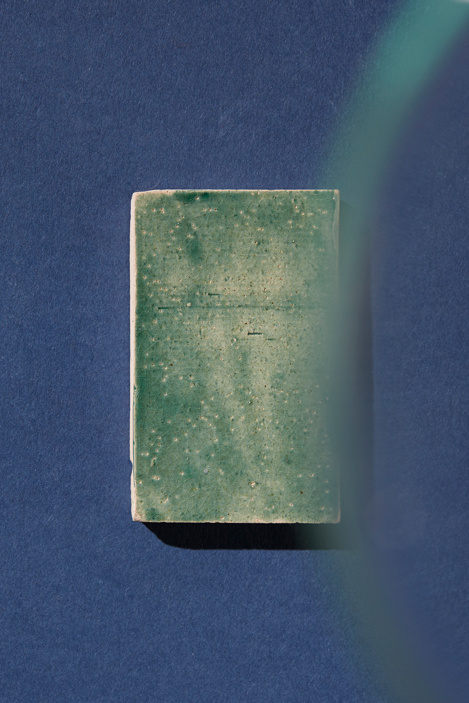
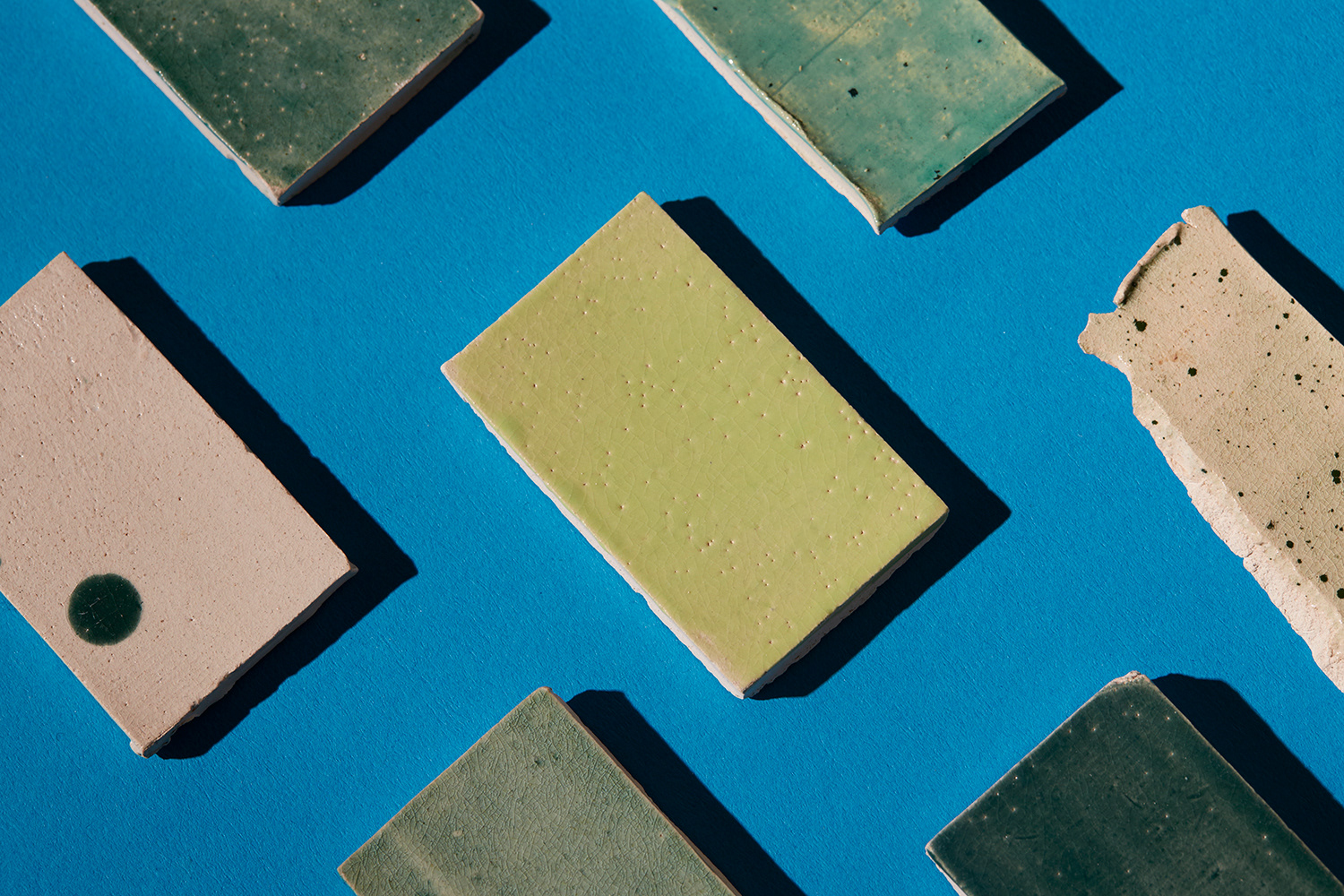
Analogous; Greens on Blues
Colours that are neighbours on the colour wheel, such as blue-green or yellow-green. Analogous colour combinations are harmonious by nature and can be used to evoke specific moods such as serenity, richness and nurture.
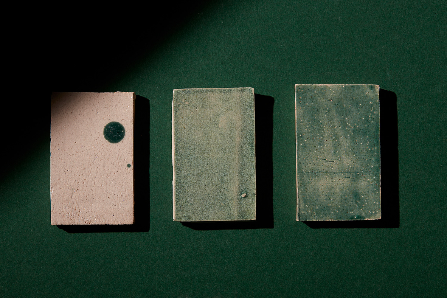
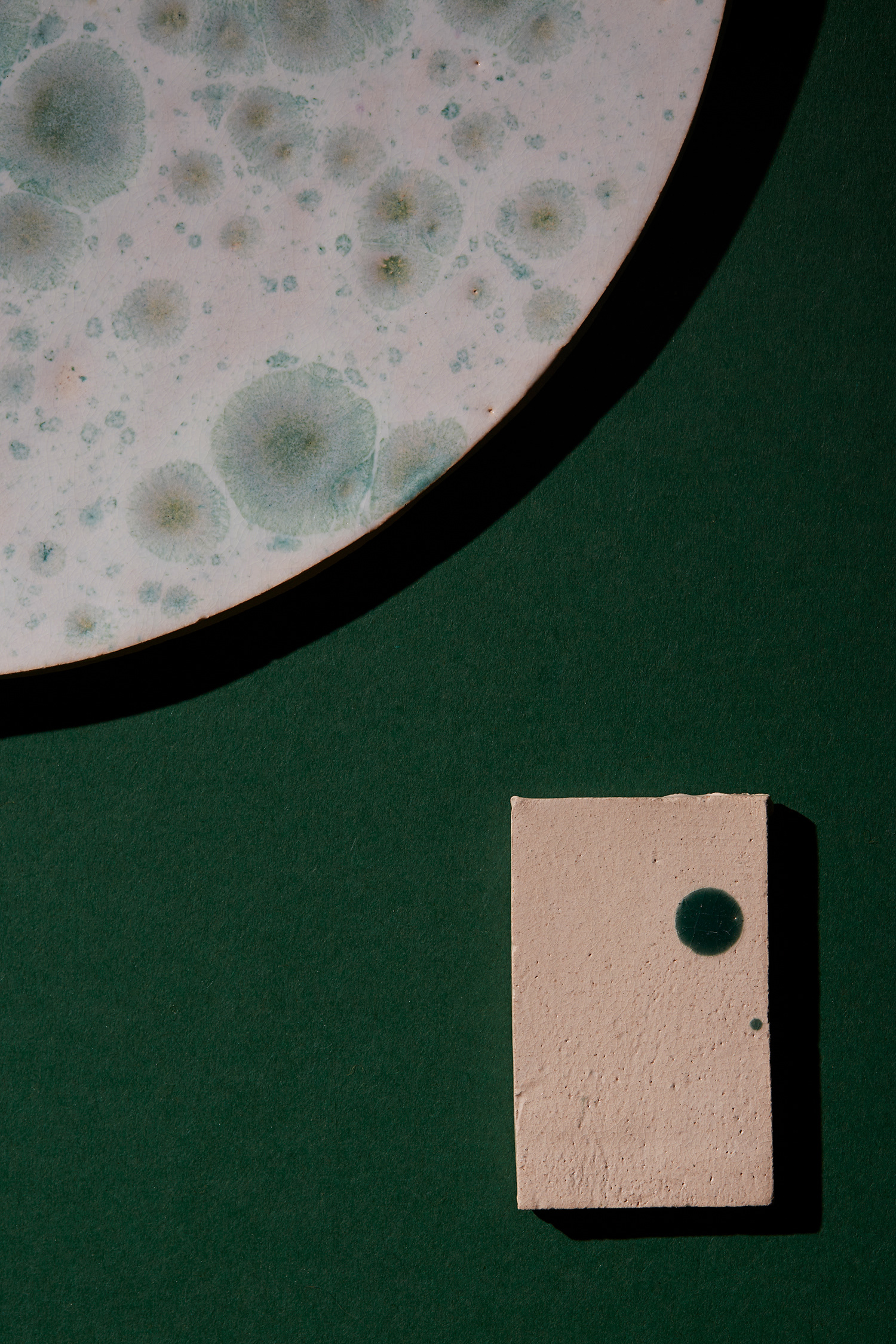
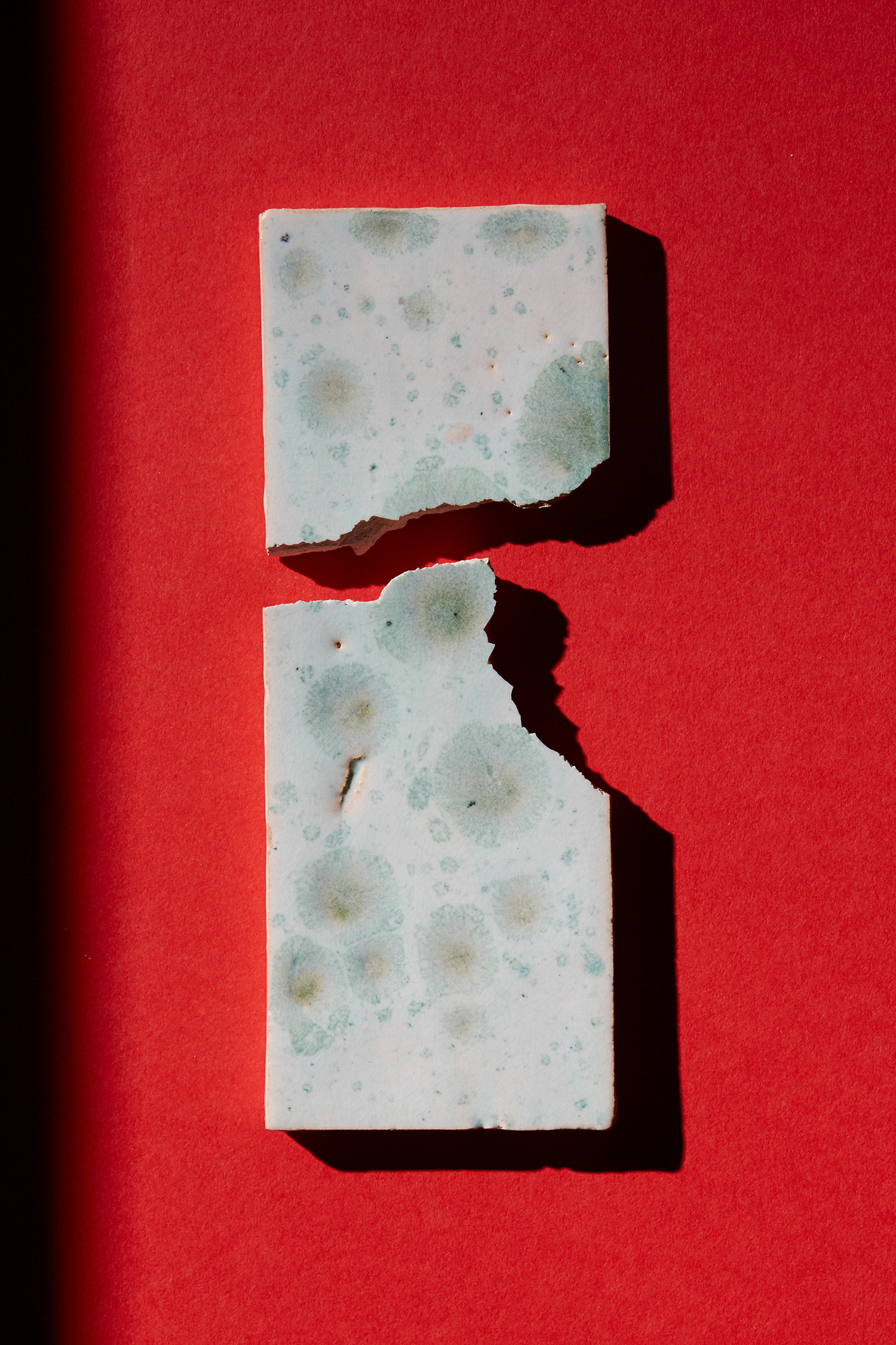
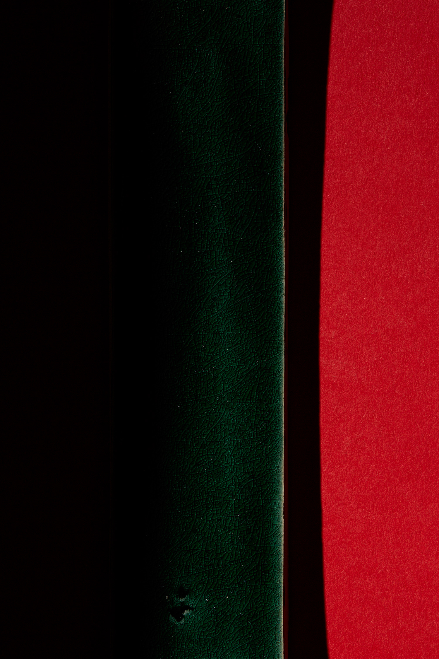
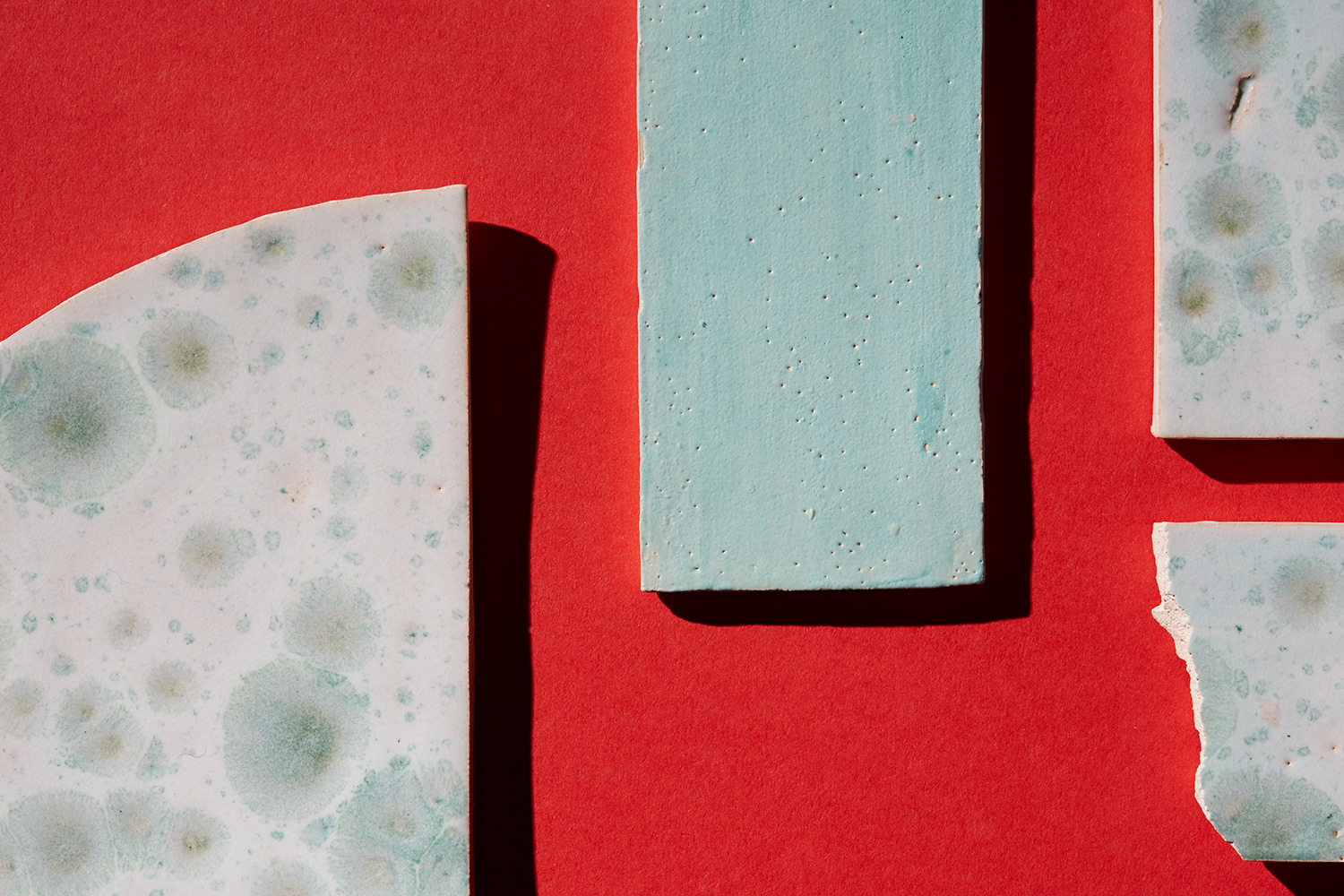
Complementary; Greens on Reds
Opposites attract, and it’s no different with colours directly opposite each other on the colour wheel. Used together, these pairings create visual energy and positively vibrating effects.
Photography in collaboration with Sara Hibbert.
SEE MORE COLOUR RESEARCH
SEE MORE COLOUR RESEARCH
FOR MORE INFO ON BESPOKE PALETTES
> LAURA@COLOUROFSAYING.COM